Best for
Single-choice routing, short surveys, lead segmentation, menus, qualification questions, and simple multiple-choice answers.
Buttons let visitors answer by selecting from predefined options. Use this block when the answer should be constrained to a short set of choices, such as team size, urgency, preferred product, support topic, or consent.
Applies to: Builder Widget Results Contact fields
Best for
Single-choice routing, short surveys, lead segmentation, menus, qualification questions, and simple multiple-choice answers.
Stores
Selected option IDs, labels, and values in workflow answers. Optionally also updates a contact field.
Routes
Single-choice options can each connect to a different path. Multiple-choice selections continue together.
| Capability | Supported |
|---|---|
| Single-choice answers | Yes |
| Multiple-choice answers | Yes |
| Per-option routing | Single-choice only |
| Contact field updates | Yes, when bound to a compatible field |
| Icons and colors | Yes |
| Horizontal and vertical layouts | Yes |
| Image-first choices | Use Picture choice instead |
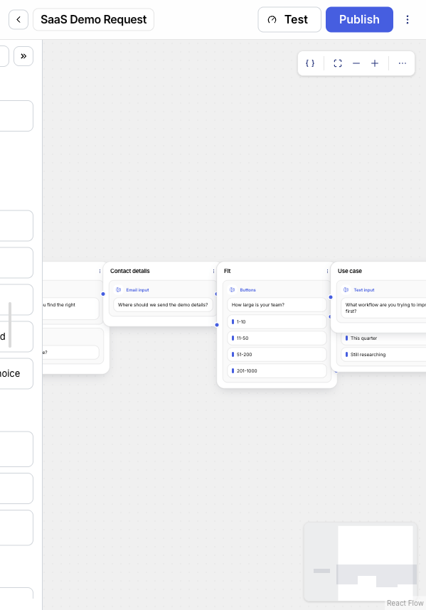
A demo request workflow asks:
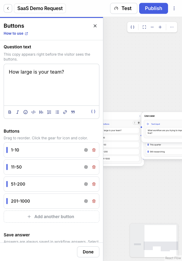
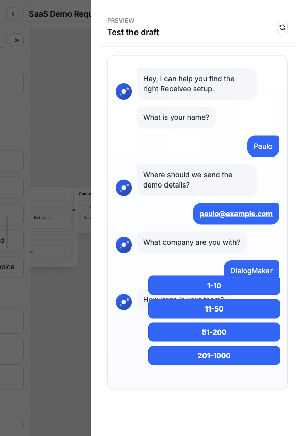
How large is your team?
The visitor chooses one option:
1-1011-5051-200201-1000The answer is saved to the workflow result and can also update a contact field such as Company size. In single-choice mode, each option can route to its own next step.
In the visitor preview, the same block appears as a short question followed by the configured buttons.
Use Buttons when the visitor should choose from a known set of labels.
Good use cases:
Use a different block when:
The question text appears immediately before the visitor sees the buttons. Keep it specific and answerable.
Good:
How soon do you want to launch?
Avoid:
Tell us what you think.
Buttons work best when each option is mutually clear and short enough to scan.
Each button option has a label. The label is what visitors see and what appears in result displays.
You can:
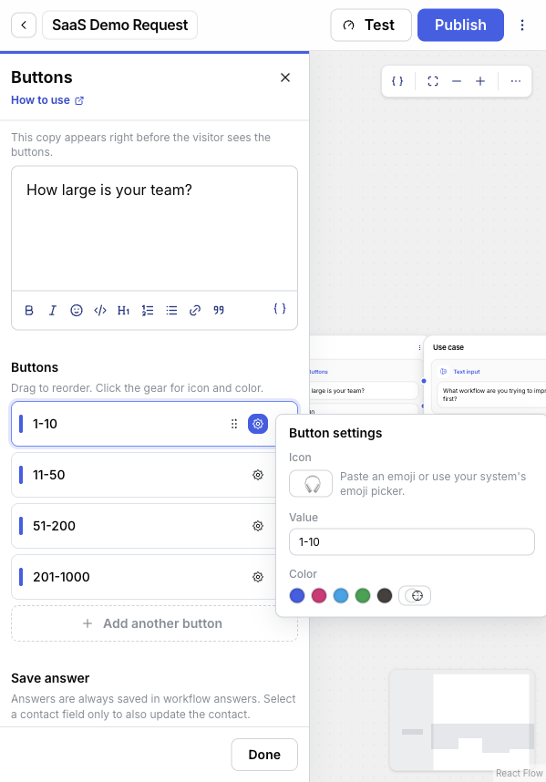
The option settings popover has a Value field. By default, the value saved when a visitor selects an option is the same as the option’s label. Set a custom value when you want the saved value to stay stable even if you rename the label later.
Visitors never see the value — they only see the label. The value appears in the workflow answer’s values field and in any contact field bound to the answer, which is what reporting, automations, and integrations read.
Common reasons to set a custom value:
Buttons answers are always saved in workflow answers. You can also bind the answer to a contact field.
The editor shows Workflow answers only when the answer should stay in the workflow result and not update the contact. Choose a compatible contact field when the selection should update the visitor’s contact profile.
For example:
| Question | Suggested contact field |
|---|---|
| How large is your team? | Company size |
| What are you interested in? | Interest |
| How soon do you want to launch? | Launch timeline |
Use single choice when the visitor should pick exactly one option.
Single-choice answers submit as soon as the visitor taps an option — there is no Continue button. Each option can connect to its own path: when the visitor selects an option, the workflow follows that option’s connected path. If the option does not have its own path, the workflow continues along the step’s default path.
Use multiple choice when the visitor can select more than one option.
Multiple-choice answers do not submit until the visitor presses Continue, so visitors can adjust their selection before sending. All selections continue together along the step’s default path. To branch after a multiple-choice answer, add a Condition block later and check the saved values.
Buttons can render horizontally or vertically in the widget.
| Layout | Use when |
|---|---|
| Horizontal | There are only a few short options, such as Yes and No. |
| Vertical | Options are longer, there are more than two options, or mobile readability matters. |
For most lead forms and menus, vertical layout is easier to scan.
Lead qualification
Ask questions like company size, budget range, or urgency. Save the answers to contact fields, then use Lead qualification or Conditions to segment the lead.
Support menu
Offer options such as Billing, Account access, Technical issue, or Talk to sales. Use single-choice routing so each option goes to a focused path.
Preference capture
Use multiple choice for interests, product categories, or newsletter topics. Add a Condition block later if the workflow needs to branch by selected values.
Yes/no gates
Use two short options when the workflow needs consent, eligibility, or a simple confirmation before continuing.
When a visitor submits a Buttons answer, DialogMaker stores the selected options as a structured value.
{ "ids": ["size-mid"], "labels": ["11-50"], "values": ["mid"]}In this example, the option’s label (11-50) is what the visitor saw, while the stored value (mid) is the stable identifier the builder set for reporting and integrations.
| Field | Meaning |
|---|---|
ids | Internal option IDs used by the workflow. |
labels | The visible labels selected by the visitor. |
values | Option values. When no explicit value is set, DialogMaker uses the label. |
For multiple choice, each array can contain more than one entry.
| Mode | Routing behavior |
|---|---|
| Single choice | The selected option can route directly to a connected target. |
| Multiple choice | The workflow continues normally after the visitor presses Continue. |
Before publishing, each single-choice option must connect to a target. If an option is missing a target, publish review reports a missing branch target.
DialogMaker rejects invalid Buttons answers when:
| Problem | What to check |
|---|---|
| The workflow does not publish | In single-choice mode, make sure every option is connected to a target. |
| The workflow does not branch after multiple selection | Multiple-choice answers continue together. Add a Condition block after the Buttons block. |
| The answer is missing from contact information | Make sure Save answer is bound to a compatible contact field. Workflow answers are still stored even without a contact field binding. |
| Visitors cannot continue | Make sure at least one option is selected. Multiple-choice visitors must press Continue. |